

One of the best ways to directly connect your business with potential customers is through web forms. Web forms are placed on your website and collect information from users, usually in exchange for something of value or some sort of follow-up. Have an email newsletter sign up on your site? Or an online application? Those are web forms. Today, we’ll give you some tips to help you improve your web forms to increase conversions.
Title
Give your form a title that explains what users will be receiving once they fill the form out. The title should give users a reason to complete the prompt. Use compelling language. Instead of just saying, “Newsletter Sign Up,” consider saying something that provides value such as, “Sign up to receive quality insights from our industry experts to advance your career.”
Fields
Fields are the boxes on a web form where users enter their information. It’s important to only ask the user for information that is absolutely necessary—generally, the more fields there are, the less likely you are to receive a form conversion. Make your form as easy to complete as possible. If you do require a higher number of fields, start with the easy questions so customers won’t be turned off right away.
Display your fields in a way that is easy to see and read. Fields should have a label describing what information is needed, such as “First Name” or “Email”. Placeholder text—usually gray text placed within a field explaining what should be written there—can be used, but don’t make the mistake of hiding field labels when a user starts typing. Users may forget what they are supposed to be doing halfway through and without a prompt, they can drift away from your form or get frustrated. Autofill is an option that can be implemented to make the form filling process even easier for customers.
Design tips:
- Align field labels and fields to the left, stacked- Less distance for the eye to travel makes for a better user experience.
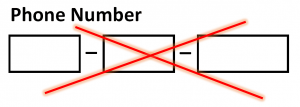
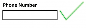
- Size fields to fit the content- The phone number box doesn’t need to be as long as the address box!
- Don’t slice data fields- Don’t split up the phone number or credit card number into separate data fields. Remember, the fewer the fields, the better!
- Use proper contrast and colors- The form should be readable indoors and outdoors and by those with poor eyesight.
- Make it mobile-friendly!- Leave space between clickable elements, use a legible font, and make sure it’s fast. For more mobile tips, check out our previous blog.
Call-to-Action (CTA)
The call-to-action button (or the submit button) on your form should be enticing to users. Tell users what they will be getting when they complete the form. Instead of just having the button say “Submit,” use language that answers the sentence “I want to….” For example, if users get a free download when they sign up for your newsletter, have your CTA be something like “Get My Free Download” instead of just “Sign Up”. First person language generally works well, but it’s best to A/B test different CTAs to see what’s best for your audience.
In regards to your CTA button’s design, it’s a good idea to have it be a contrasting color from other elements on your page so it stands out. Make your button large enough to be noticeable but not so big that it looks spammy. Consider the page on a whole. Your button should be obvious, but not obnoxious.
Thank You
So, you finally got someone to fill out your form… now what?! Next comes the thank you page. Let users know that they have completed the form successfully and also explain what they should expect or do next. Take advantage of their attention and direct it in a way that is helpful to your business whether that is exploring products/services, encouraging sharing on social media, reading a relevant blog post, or something else beneficial.
It’s also a good idea to de-index your thank you pages so they don’t appear in search engine results. You don’t want your thank you pages to compete with your main content pages in SERPs.
Conversion Tracking
Conversion tracking allows you to see which users are connecting with you on your website. In the case of a web form, set up a URL-based goal that can track users that complete the form and see the thank you page. This will help you know how well your form is performing.
Taking a good look at your web forms and designing them in a user-friendly fashion can go a long way in capturing good quality leads. Take these tips into consideration to make your web forms work for you!