

Search Engine Optimization (SEO) is essential if you want users to find your business through search and get organic traffic to your website. Nowadays, more and more people are using mobile devices to search, so it’s imperative to optimize for those mobile devices. If you need more convincing, Google has announced their switch to mobile-first indexing (meaning the mobile version of a website is considered its main version), so having mobile-friendly sites and content is more important than ever. In this two-part series, we will give you 7 mobile SEO tips to help your website rank higher in search engines.
Configure It
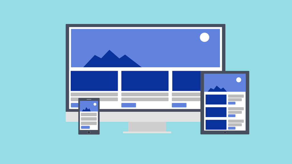
First off, it is vital that you configure your website to display well on a variety of devices/screen sizes. There are 3 main ways to do this:
- Separate URLs (having a separate URL for the mobile version of your site)
- Dynamic Serving (HTML/CSS changes according to device)
- Responsive Design (page layout responds to type of device user is using)
We recommend the use of responsive design. Responsive design serves the same content for desktop and mobile devices, so there isn’t the risk of faulty redirects which can happen if you have separate mobile URLs. It is also the method recommended by Google.
Make It Speedy
Page speed impacts user experience and is taken into consideration by Google when ranking for mobile searches. To improve page speed, consider doing the following:
- Compress Images- Compressing images reduces their file size, which can significantly speed up load times.
- Use a CDN- A Content Delivery Network can help page elements load faster and is great for those with an international audience.
- Leverage Browser Caching- Caching your site makes it load faster and is recommended by Google.
- Clean Up Code- Minify code to reduce load times and bandwidth usage on your website.
- Reduce Redirects- Redirects can cause performance and speed issues, so only use them if absolutely necessary.
Implementing these changes can dramatically increase page speed.
Keep It User-Friendly

There are a few things you can do to assure your site design is appropriate for mobile, not only for SEO purposes but also for user experience.
- Use Playable Video Content- Not all types of video can be played on mobile, so use video-embedding that works with all devices. Stick to HTML5 standards for animations, don’t use Flash, and look into the possibility of having a video transcript available for your users.
- Nix the Popups- Popups can be hard to close on mobile and prevent users from accessing content. If you need to keep popups, use a display option suggested by Google, like using popup banners that don’t take up the whole screen.
- Design for Fingers- Give space between clickable elements, so users can tap wherever they intend to without accidentally clicking something else.
- Make Fonts Legible- When writing for a smaller screen, it’s important to keep font size large enough to read easily. There should be contrast between text and background so users can read in different lighting scenarios (inside and outside). Additionally, consider condensing information to increase readability.
These are just a few of the adjustments you can make to optimize your site for mobile. Stay tuned for our next installment where we will discuss optimizing titles and meta descriptions, optimizing for local search, using structured data, and keeping your pages crawlable.