
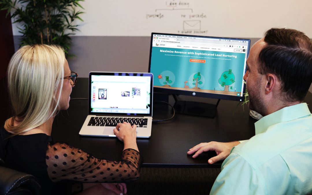
A landing page is a web page that is accessed from a paid marketing, social, or email campaign, created for the sole purpose of having your users complete a certain task. Would you like users to sign up for a program you are offering? Or call you about a service you provide? A landing page is a clear way to direct traffic with the sole purpose of converting.
In this blog, we’ll look at best practices to use when creating a landing page.
Heading
The heading you use on your landing page should be attention-grabbing, concise, and should clearly identify your offer. Its language should also match that in the ad campaign that visitors clicked on to get to your landing page. You want to assure visitors that they’ve landed on the correct page or you’ll run the risk of them bouncing.
Message
Make sure your landing page content is straightforward and demonstrates the value of your product or service in a clear and concise way. Highlighting info with bullet points and symbols can help simplify copy. Your message should show how your offering will fulfill your visitors’ needs. Include information that will help drive conversions, but keep the copy succinct and easy to understand.
Call-to-Action (CTA)
The Call-to-Action is the task you would like the user to complete while on your page. It could be represented with a button, a form to fill out, a phone number to call, etc. Your CTA should stand out on your page and be unmissable. To accomplish this, you can try using contrasting colors, imagery that visually guides the user’s eyes to the CTA (i.e. arrows or people pointing), or try surrounding the CTA with negative space so it’s obvious and clear. Another thing to keep in mind is the location of your Call-to Action. In most cases, it’s best to place it above the fold (the area the user sees before scrolling down) on your page. If for any reason it can’t be above the fold, make sure you guide your visitors to it.
It’s important to make your Call-to-Action easy and effortless for your audience to complete. Only capture information from your visitors that is absolutely necessary. Also, consider using compelling language—something like “Get My Free Download” or “Receive Your Offer Now” is more enticing than “Submit.”
Design
When designing your landing page, make sure the visual elements stay aligned with the offer you are presenting. The page should look cohesive and, as mentioned above, similar to the ad that got the user there. Choose imagery that supports your message. Video can be helpful in demonstrating value and convincing users to convert.
It is also imperative that your landing page is responsive. Be sure it has the proper layout for those on mobile devices and that any phone numbers listed are Click-to-Call.
Testimonials/Reviews
Testimonials and reviews can help establish reputability and trust in your brand. Consider incorporating quotes with photos from real customers (or even videos), listing the companies (with logos) who have benefitted from your services, or including social media posts from current users.
Thank You Page
Create a thank you page to pair with your landing page. Thank you pages let users know that they have completed a task successfully and explain what they should expect or do next. It is an opportunity to share content, social links, products/services, and direct visitor attention in a way that is beneficial for your business.
Testing
Once your landing page is complete, test it. Ensure that all the links and buttons work properly, that it’s leading visitors where you want them to go, and that it is easy for people to use. You can run A/B Tests through Google Optimize to let user data help determine the optimal set up and language to increase conversions.
Landing pages can vary depending on the product or service you are offering and the tasks you would like visitors to complete. Be sure to tailor your landing page so it aligns with your specific brand and offering.